
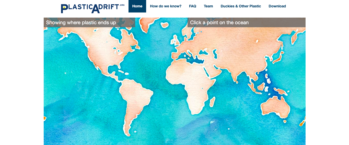
What is the interactive about?
PlasticAdrift is an interactive online website created by a team: Dr Erik van Sebille, David Fuchs and Jack Murray. It is a tool that shows how ocean currents carry plastic around the world. It generates a positioning of the plastic in a likely path over a ten year period into the future.
Who is it designed for?
The target audience for PlasticAdrift would be environmental scientists, as they can use this website to understand the process of where plastic is likely to end up over time and develop a solution to this environmental problem
Creators also created this website for individuals that have a commitment to greener lifestyles and want to protect the environemnt
What knowledge does it assume of the target audience I.e. digital literacy?
The interactive assumes that the user understands the idea behind thermal maps and the association that thermal maps can be used to describe the severity of something eg. green means not so bad vs red means very bad
Describe the type of user interactions, and the user interface.
The user interface isn’t very strong. With minimal instructions and no contextual informative paragraphs, the explanation is left to the user’s assumptions. I believe the website should include further information on how it came to that conclusion (of it’s predictions) and it’s source information to backup the claims. In addition, the site does not respond well to other devices except for desktop. In conclusion, it was not designed to a full degree.
What can you say about the visual design- layout, colour, and typography? – How would you describe the style?
The website’s The website’s visual design is minimal and focuses mainly on the interactive map evident in the home page, while other pages mainly consist of text and some imagery. It’s layout is conventional in the sense that there is a use of columns and margins on the left and right sides of each page. The colour palette is mostly monochromatic, which is evident through the various tones of blue. A simplistic sans serif typeface has been utilised throughout the website, however, it’s application is repetitive and essentially lacks the appeal to capture the user’s attention. The overall style is quite basic and simplistic, as it isn’t very inviting especially after the home page.
What improvements would you suggest?
Seeing that the website isn’t very inviting or visually appealing, a bolder and more distinctive typeface for the headings and even the logo would be recommended. This would provide greater contrast between the headings and paragraphs. The video under ‘how do we know?’ could maybe be set to autoplay, which could further capture the attention of the user. Possibly a better use of spacing, padding or margins throughout, because the header, footer, text and visuals are all quite cluttered and very close together. The footer and header could have a different colour to allow for a point of difference from the rest of the website. The footer and header could have a different colour to allow for a point of difference from the rest of the website.
