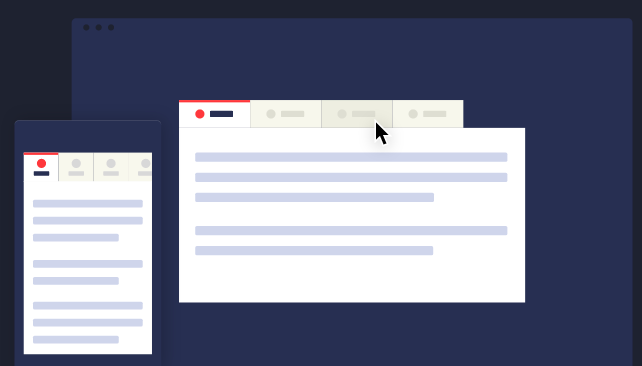
Screen designs review feedback
Logo design review feedback
Feedback sheet
Lecture 7: User interface design visual patterns
- Interface design is about presenting the right tools and accomplish their goals for the user
- User interface is a connection between the user and the experience
- Good UI interfaces should create a balance between aesthetics and interactivity
- Interfaces should have the ability to guide the user through their experience.
- Sometimes good UI interfaces can be difficult to create due to the simple principles that have to be undertaken
- The user experience of a website should be filled with positivity
- The users should enjoy being on the website or application
- Typically, the company’s design team work on the user interface; menu options, button, text and videos
- The way the user experience is created affects how the user feels
Common Navigation patterns
- Tabs
- Navigation tabs
- Module tabs
- They are influenced by actual tabs in a file cabinet
- Tabs can be used when content needs to be separated in sections and is accessed through a clear navigation structure
- The section’s names should be relatively short to create a neat and structured framework
- They can be possibly used till the width of the page
2. Menus
- Horizontal dropdown menu
- Vertical dropdown menu
- Accordion menu
- Search bars with a dropdown menu assist the user in accessing information quickly regardless of hierarchy
- By adding a shortcut, the path can be shortened and the number of clicks can be lessened and help in decreasing the risk of confusion
- Drop down menus are used when the user needs to navigate through sections of a website
- The place is usually limited
- They are used for 2 to 9 sections
- Drawer menus save space and guide the key items together
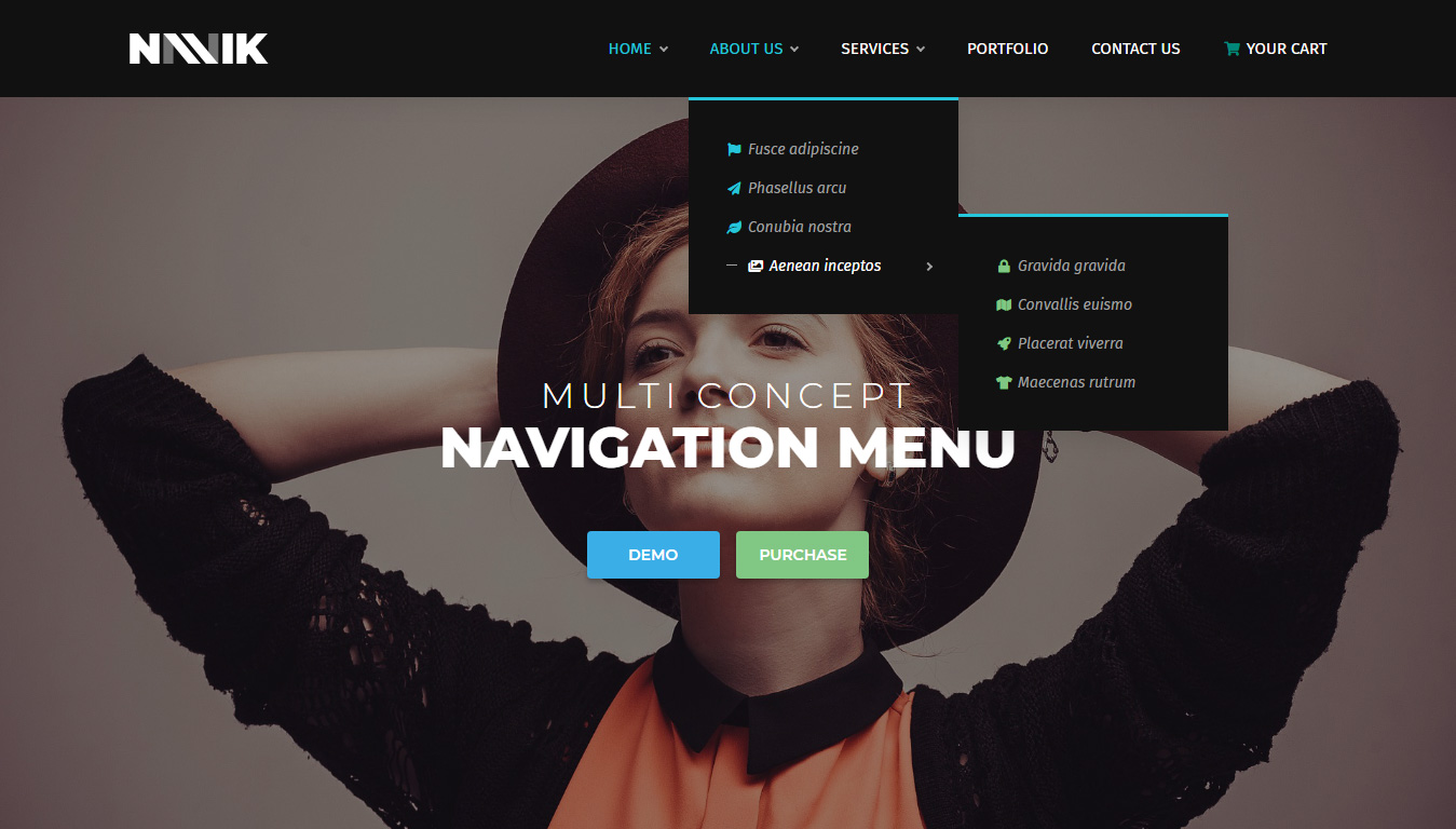
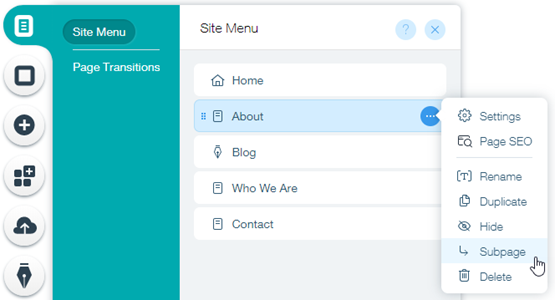
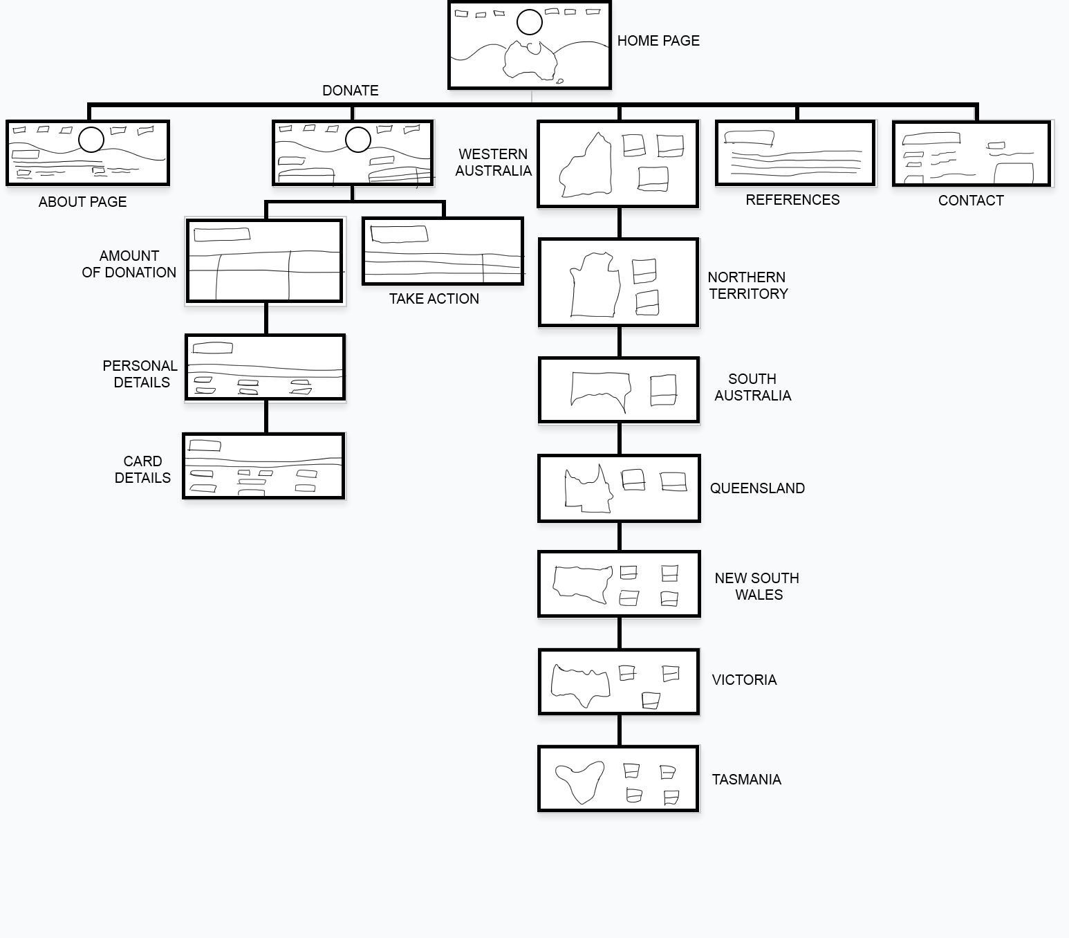
3. Jumping in hierarchy
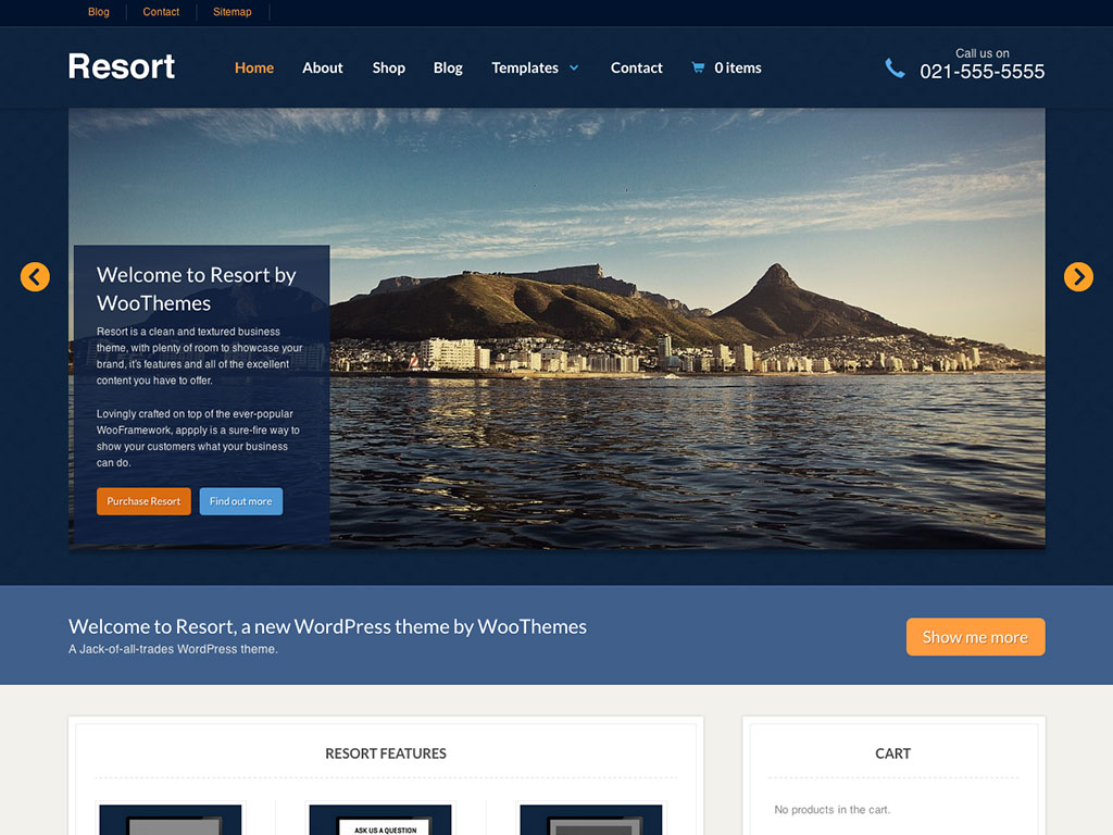
- Shortcut dropdown
- Big footer
- Big footers are used when users need a mechanism to access sections quickly
- They are used as a shortcut for pages that are frequently used
- In addition, they are also used for shortcuts that are on a different hierarchy level
- Home link
- A site’s logo or a button can be used as a link to the home page
- Breadcrumbs
- They are used when the user needs to know their location in the website’s hierarchical structure
- The structure of the website is more understood when this is used
- The term of bread crumb depicts the history of how the user got to the page
- They are used when the website follows a strict hierarchy structure
4. Content
- Carousel is used when the user needs to browse through a set of items and select one of them
- It is also used when there is a wide list of items that need to be shown, but simultaneously focus on selecting a few items at a time
- It lets the user knows there are more items available than what is currently being shown
- Event calendar
- Article list
Reflection
The lecture in Week 7 was based on visual patterns on user interfaces. The pod consisted of a variety of visual patterns that are commonly used. I have some knowledge of these visual patterns, as they are used on a wide variety of websites that I use or some that I come across in situations such as studying and doing assignments. It was brought to my attention that there are many details and reasons when using these visual patterns. The fact that web designers have to think about is the best way to display their information was very engaging to me. The concept of visual patterns forced me to reflect on my career as a graphic designer – how information can be presented neatly but appealing at the same time.
Screen designs for Assessment 2
User flow for Assessment 2
Lecture 6: Scenarios
- User scenarios are the stories that your personas act out
- They are thoughts or exercises that are displayed visually
- They can predict how specific users will interact with your website in a given situation with a given goal
- If a user persona fails at a task, the designer is given a visual representation of the problem and they go back and solve it
- They test the site structure before it is fully developed and isolate problems before they erupt
- The notes track different behaviours or stories or steps through the website
- Every successful design begins with a understanding of who uses the product
- There is quality involved in research, patterns and behaviours in goals amongst the people that are interviewed
- Out of those interviews, fictional users are created which are called user personas; have the same concerns and goals
- Personas guide the design from the beginning to the end
- Once a persona is identified, the designer creates scenarios to explore the interactions that they could possibly have with the product
- Designers think about their typical day, the common problems they solve and the questions they ask
Reflection
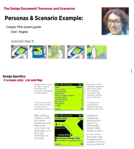
The lecture in Week 6 was based on user scenarios. The pod consisted of the definition of a user scenario; stories and narratives that the user persona acts out and examples that further emphasised the topic. It was brought to my attention that there are many procedures undertaken when creating a product. The fact that designers and creators take in their target market to another level was very engaging to me. Having the example of Angela, the user personas, was very helpful because it made me interpret the concept easier and better. The concept of user scenarios forced me to reflect on my career as a graphic designer – how will my design work be discovered, the questions users might be curious about and the problems that might occur.