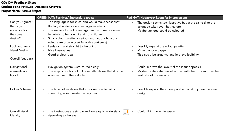
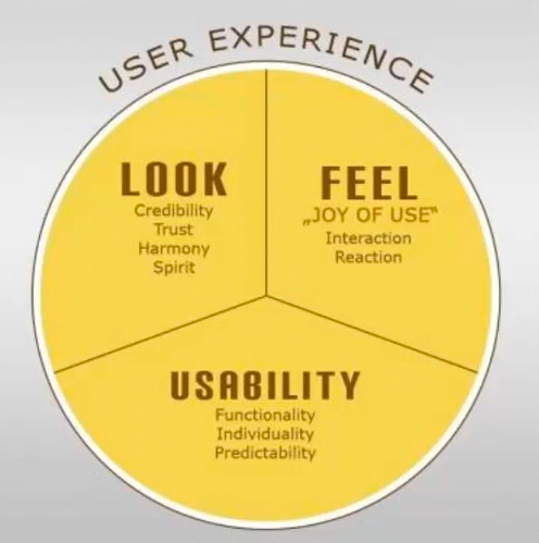
Interface design is about presenting the right tools and accomplish their goals for the user User interface is a connection between the user and the experience User Experience vs User Interface . (2019). [Diagram]. Retrieved from https://vimeo.com/319376545 Good UI interfaces should create a balance between aesthetics and interactivity Interfaces should have the ability to guide the user through their experience. Sometimes good UI interfaces can be difficult to create due to the simple principles that have to be undertaken Würstl, D. (2009). User Experience consists of Usability, Look and Feel [Diagram]. Retrieved from https://commons.wikimedia.org/wiki/File:Ux_katzenbergdesign_engl.jpg The user experience of a website should be filled with positivity The users should enjoy being on the website or application Typically, the company’s design team work on the user interface; menu options, button, text and videos The way the user experience is created affects how the user feels Common Navigation patterns
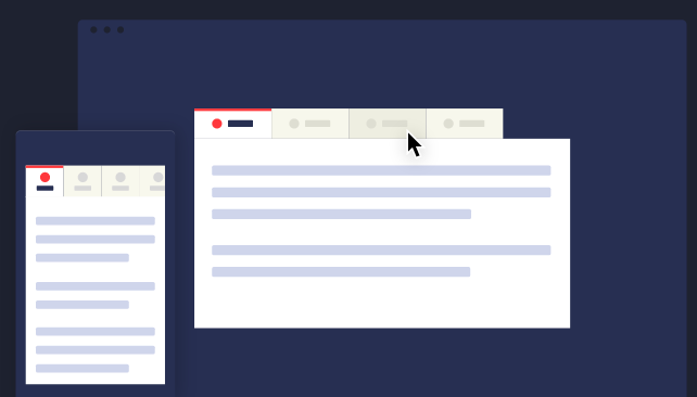
Tabs Navigation tabs Module tabs They are influenced by actual tabs in a file cabinet Tabs can be used when content needs to be separated in sections and is accessed through a clear navigation structure The section’s names should be relatively short to create a neat and structured framework They can be possibly used till the width of the page CodyHouse. (2014). Navigation tabs [Illustration]. Retrieved from https://codyhouse.co/assets/img/gems/hero/responsive-tabbed-navigation-featured.svg 2. Menus
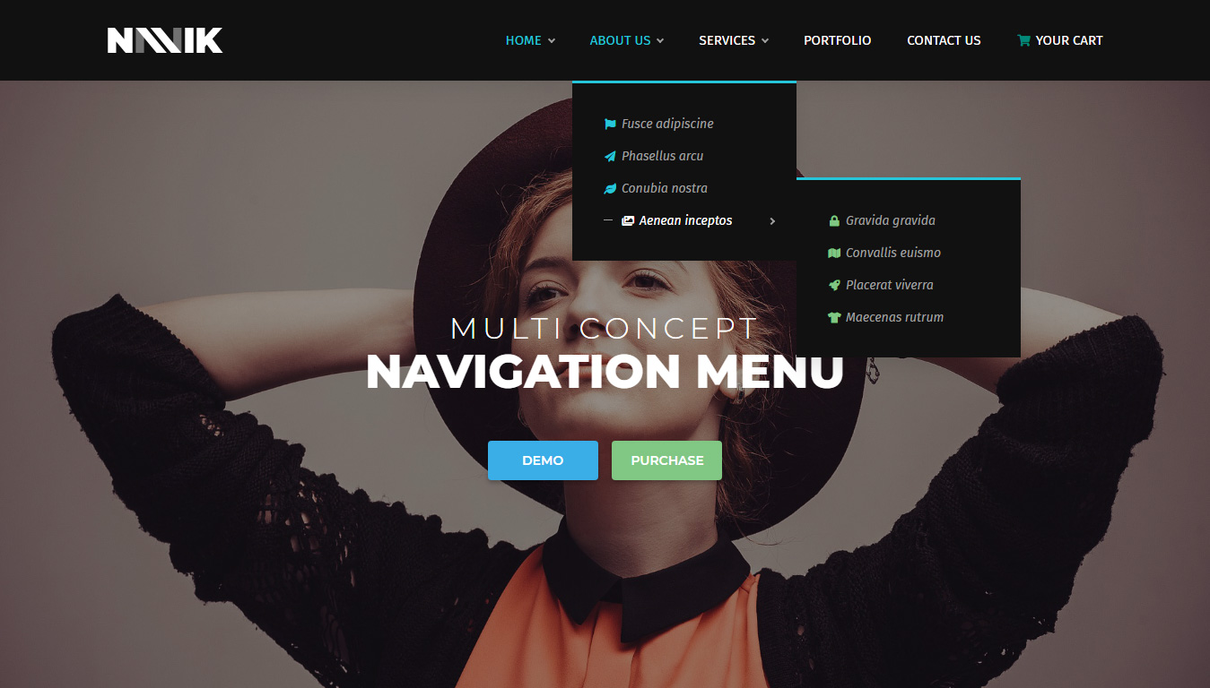
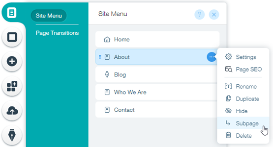
Horizontal dropdown menu Vertical dropdown menu Accordion menu Search bars with a dropdown menu assist the user in accessing information quickly regardless of hierarchy By adding a shortcut, the path can be shortened and the number of clicks can be lessened and help in decreasing the risk of confusion Lou, M. (2010). Search bar with dropdown menu [Screenshot]. Retrieved from https://tympanus.net/codrops/2010/07/14/ui-elements-search-box/ Drop down menus are used when the user needs to navigate through sections of a website Navik. (2018). Dropdown menu [Screenshot]. Retrieved from https://www.decolore.net/30-modern-css-navigation-dropdown-menu-examples/ The place is usually limited They are used for 2 to 9 sections Drawer menus save space and guide the key items together Wix. (2019). Drawer menu [Screenshot]. Retrieved from https://support.wix.com/en/article/creating-a-subpage-drop-down-menu 3. Jumping in hierarchy
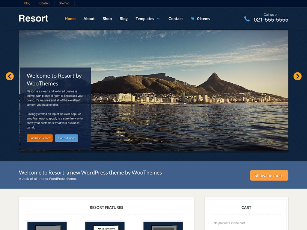
Shortcut dropdown Big footer Big footers are used when users need a mechanism to access sections quickly They are used as a shortcut for pages that are frequently used In addition, they are also used for shortcuts that are on a different hierarchy level Fusion Design Creative Solutions. (2016). Big footer [Screenshot]. Retrieved from https://www.elegantthemes.com/blog/resources/15-elegant-footer-designs-for-your-next-wordpress-client-project-and-what-makes-them-work Home link A site’s logo or a button can be used as a link to the home page WooThemes. (2016). Home page [Image]. Retrieved from http://www.handibible.com/5-simple-steps-for-a-killer-home-page/ Breadcrumbs They are used when the user needs to know their location in the website’s hierarchical structure The structure of the website is more understood when this is used The term of bread crumb depicts the history of how the user got to the page They are used when the website follows a strict hierarchy structure Amazon. (2018). Breadcrumb [Screenshot]. Retrieved from https://speckyboy.com/breadcrumbs-web-design/ 4. Content
Carousel is used when the user needs to browse through a set of items and select one of them It is also used when there is a wide list of items that need to be shown, but simultaneously focus on selecting a few items at a time It lets the user knows there are more items available than what is currently being shown Dell. (2013). Carousel [Screenshot]. Retrieved from https://www.nngroup.com/articles/designing-effective-carousels/ Event calendar Article list Reflection
The lecture in Week 7 was based on visual patterns on user interfaces. The pod consisted of a variety of visual patterns that are commonly used. I have some knowledge of these visual patterns, as they are used on a wide variety of websites that I use or some that I come across in situations such as studying and doing assignments. It was brought to my attention that there are many details and reasons when using these visual patterns. The fact that web designers have to think about is the best way to display their information was very engaging to me. The concept of visual patterns forced me to reflect on my career as a graphic designer – how information can be presented neatly but appealing at the same time.
