Lecture Notes · Week 7 work

Lecture 7: User interface design visual patterns

  • Interface design is about presenting the right tools and accomplish their goals for the user
  • User interface is a connection between the user and the experience
User Experience vs User Interface. (2019). [Diagram]. Retrieved from https://vimeo.com/319376545
  • Good UI interfaces should create a balance between aesthetics and interactivity
  • Interfaces should have the ability to guide the user through their experience.
  • Sometimes good UI interfaces can be difficult to create due to the simple principles that have to be undertaken
Würstl, D. (2009). User Experience consists of Usability, Look and Feel [Diagram]. Retrieved from https://commons.wikimedia.org/wiki/File:Ux_katzenbergdesign_engl.jpg
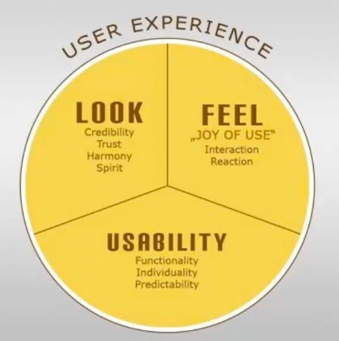
  • The user experience of a website should be filled with positivity
  • The users should enjoy being on the website or application
  • Typically, the company’s design team work on the user interface; menu options, button, text and videos
  • The way the user experience is created affects how the user feels

Common Navigation patterns
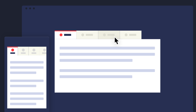
  1. Tabs
  • Navigation tabs
  • Module tabs
  • They are influenced by actual tabs in a file cabinet
  • Tabs can be used when content needs to be separated in sections and is accessed through a clear navigation structure
  • The section’s names should be relatively short to create a neat and structured framework
  • They can be possibly used till the width of the page
CodyHouse. (2014). Navigation tabs [Illustration]. Retrieved from https://codyhouse.co/assets/img/gems/hero/responsive-tabbed-navigation-featured.svg

2. Menus

  • Horizontal dropdown menu
  • Vertical dropdown menu
  • Accordion menu
  • Search bars with a dropdown menu assist the user in accessing information quickly regardless of hierarchy
  • By adding a shortcut, the path can be shortened and the number of clicks can be lessened and help in decreasing the risk of confusion
Lou, M. (2010). Search bar with dropdown menu [Screenshot]. Retrieved from https://tympanus.net/codrops/2010/07/14/ui-elements-search-box/
  • Drop down menus are used when the user needs to navigate through sections of a website
Navik. (2018). Dropdown menu [Screenshot]. Retrieved from https://www.decolore.net/30-modern-css-navigation-dropdown-menu-examples/
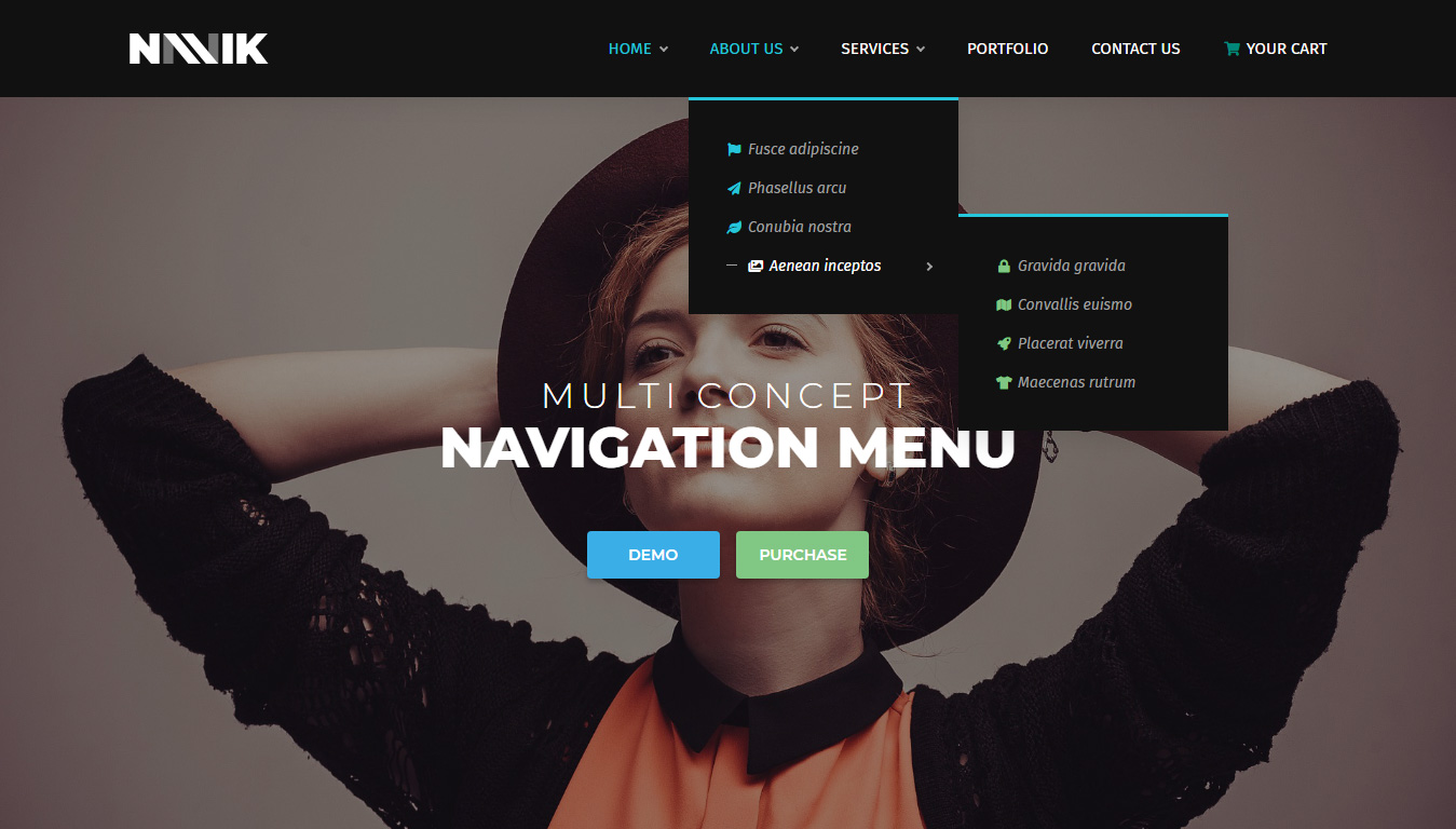
  • The place is usually limited
  • They are used for 2 to 9 sections
  • Drawer menus save space and guide the key items together
Wix. (2019). Drawer menu [Screenshot]. Retrieved from https://support.wix.com/en/article/creating-a-subpage-drop-down-menu

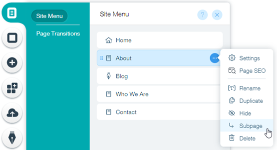
3. Jumping in hierarchy

  • Shortcut dropdown
  • Big footer
  • Big footers are used when users need a mechanism to access sections quickly
  • They are used as a shortcut for pages that are frequently used
  • In addition, they are also used for shortcuts that are on a different hierarchy level
Fusion Design Creative Solutions. (2016). Big footer [Screenshot]. Retrieved from https://www.elegantthemes.com/blog/resources/15-elegant-footer-designs-for-your-next-wordpress-client-project-and-what-makes-them-work
  • Home link
  • A site’s logo or a button can be used as a link to the home page
WooThemes. (2016). Home page [Image]. Retrieved from http://www.handibible.com/5-simple-steps-for-a-killer-home-page/
  • Breadcrumbs
  • They are used when the user needs to know their location in the website’s hierarchical structure
  • The structure of the website is more understood when this is used
  • The term of bread crumb depicts the history of how the user got to the page
  • They are used when the website follows a strict hierarchy structure
Amazon. (2018). Breadcrumb [Screenshot]. Retrieved from https://speckyboy.com/breadcrumbs-web-design/

4. Content

  • Carousel is used when the user needs to browse through a set of items and select one of them
  • It is also used when there is a wide list of items that need to be shown, but simultaneously focus on selecting a few items at a time
  • It lets the user knows there are more items available than what is currently being shown
Dell. (2013). Carousel [Screenshot]. Retrieved from https://www.nngroup.com/articles/designing-effective-carousels/
  • Event calendar
  • Article list

Reflection

The lecture in Week 7 was based on visual patterns on user interfaces. The pod consisted of a variety of visual patterns that are commonly used. I have some knowledge of these visual patterns, as they are used on a wide variety of websites that I use or some that I come across in situations such as studying and doing assignments. It was brought to my attention that there are many details and reasons when using these visual patterns. The fact that web designers have to think about is the best way to display their information was very engaging to me. The concept of visual patterns forced me to reflect on my career as a graphic designer – how information can be presented neatly but appealing at the same time.

Lecture Notes · Week 6 work

Lecture 6: Scenarios

  • User scenarios are the stories that your personas act out
  • They are thoughts or exercises that are displayed visually
  • They can predict how specific users will interact with your website in a given situation with a given goal
  • If a user persona fails at a task, the designer is given a visual representation of the problem and they go back and solve it
  • They test the site structure before it is fully developed and isolate problems before they erupt
  • The notes track different behaviours or stories or steps through the website
  • Every successful design begins with a understanding of who uses the product
  • There is quality involved in research, patterns and behaviours in goals amongst the people that are interviewed
  • Out of those interviews, fictional users are created which are called user personas; have the same concerns and goals
  • Personas guide the design from the beginning to the end
  • Once a persona is identified, the designer creates scenarios to explore the interactions that they could possibly have with the product
  • Designers think about their typical day, the common problems they solve and the questions they ask
Interaction Design Foundation. (2019). User scenario mapping [Diagram]. Retrieved from https://www.interaction-design.org/literature/topics/user-scenarios
User scenario mapping. (2019). [Illustration]. Retrieved from https://vimeo.com/319376412

Reflection

The lecture in Week 6 was based on user scenarios. The pod consisted of the definition of a user scenario; stories and narratives that the user persona acts out and examples that further emphasised the topic. It was brought to my attention that there are many procedures undertaken when creating a product. The fact that designers and creators take in their target market to another level was very engaging to me. Having the example of Angela, the user personas, was very helpful because it made me interpret the concept easier and better. The concept of user scenarios forced me to reflect on my career as a graphic designer – how will my design work be discovered, the questions users might be curious about and the problems that might occur.

Assessment 2 work · Lecture Notes · Week 5 work

User scenarios for Assessment 2

User: Mark

Novice

Mark is a 21-year-old Australian man living in Coles Bay, Tasmania. Mark has a hobby of going fishing in his free time. His favourite fish to catch and cook are banded morwong. Mark is unsure if they are overfished in Tasmania. Mark navigates to rescueproject.com.au on his personal computer connected to the internet at home. The map of Australia appears and the website informs Mark to click a state to check the status of species in that area. He selects Tasmania on the map. Mark then clicks on Tasmania Banded Morwong Fishery, being closest to his hometown, Coles Bay. Mark reads that their status is “DEPLETING”. He believes that it is better off not to fish them on that day and to check their status another time to see if It has changed.

User: Dakota

Expert

Dakota is a 30-year-old university student living in Brisbane, Queensland. She is studying to become a marine biologist and lives in Brisbane, Queensland. Dakota is currently an intern at Australia Fisheries Management Authority and was briefed to conduct a list statistics on marine species in Queensland. Dakota navigates to rescueproject.com.au on a personal laptop connected to the internet in the student residence. The map of Australia appears and Dakota clicks on Queensland. Dakota goes through each fishing region on the page; Gulf of Carpentaria, Carpicon Bunker Reef, East Coast and South-East Coast. Dakota records the marine species statuses and additional information, thus using this information in her study.

Lecture Notes · Week 5 work

Lecture 5: Personas

  • User needs are inside of objectives
  • They drive the functional aspects and content needs
  • Identifying the user successfully leads to a flow effect of the entire project
  • Have been used with user experience documentation since the mid 1990s
  • They are referenced throughout our creative process, validate our designs and user experience
  • Personas are representations of goals and behaviour of a hypothesised group of users
  • Personas are extracted from data collected interviews with users
  • They are captured with descriptives including behaviour patterns, goals, skills, attitudes, environment (context)
  • Each product has more than one person
  • That one person should be the primary faces for the design
Babich, N. (2017). User persona [Image]. Retrieved from https://theblog.adobe.com/putting-personas-to-work-in-ux-design-what-they-are-and-why-theyre-important/

User Personas

  • Age
  • Occupation
  • Sex
  • Hoobies
  • Like/Dislikes
  • Other details
  • Behaviour patterns
  • Goals
  • Skills
  • Attitudes
  • Environment
  • Personas assist you in designing design a clear image of the user
  • It is specific and gives shape to user base and avoids a vague or boring idea
  • Reviewing personas before wireframe is very critical so it can create a sense of figure and pathway

Large vs small audience

  • Who is your audience?
  • Large audiences have a broad view
eBay. (2012). eBay homepage [Screenshot]. Retrieved from https://www.ecommercebytes.com/C/blog/blog.pl?/pl/2012/5/1337305023.html
  • Small personas have a more intimate and personal view
Club Penguin. (2011). Club Penguin homepage [Screenshot]. Retrieved from https://www.youtube.com/watch?v=eE22z99NhNY
  • When defining personas, what are the tasks and what are the users trying to perform?
  • Ask yourself, are there different tasks for different personas?
  • Defining personas can help uncover new cases
  • Diving deeper, we find out how that user gets to the task in the first place
  • Different personas = different parts
  • What devices are the personas using?
  • Are they expecting a cross platform experience?
Lim, J. (2018). Cross platform [Illustration]. Retrieved from https://lawtech.asia/wp-content/uploads/2018/06/alldevice-900×528.jpg
  • “Meet the users where they are”
  • Users who want to browse vs users who want specific contents
Smith, J. (2012). Users taking different paths [Diagram]. Retrieved from https://cdn.tutsplus.com/webdesign/uploads/legacy/articles/090_personas/two_flows.jpeg
  • Direct users where they want to go

Artefact personas

  • Personas that are created to product, not the user
  • Product personality questions are involved and arrange a desired personality

Reflection

  • The lecture in Week 5 was revolved around personas. The pods mainly consisted of users personas, which are fictional characters that are created based upon research in order to represent different types that may be useful for a website. I found that the concept of user personas was a new piece of information to me. I was not aware that personas were created and it made me realise that they play a big role in marketing. The representation of personas forced me to reflect on my career as a graphic designer and illustrator – how my design work should involve the customer’s goals, points, behaviour and demographic information.
Lecture Notes · Week 4 work

Lecture 4: Instructional Design

Instructional Design

  • How to “do something” or explain “how something works”
  • To explain “how something works”

Split attention effect

  • Sources of information that are dependent for comprehension
  • Are separated either spatially or temporally 

Instruction

  • By clicking buttons  
  • Usually composed of drawings / photographs and written instructions.
  • They are used to explain stage by stage, how something works or how something is put together.
Addicting Games. (2009). Guitar Master gameplay [Screenshot]. Retrieved from http://www.freeaddictinggames.com/game/guitar-master/

Conversation

  • Back and forth dialog
  • Provide a graphical method of specifying the sequence of screens that you are designing
  • It is important to plan the sequence in consultation with a user.  As the designer you need to know how they will use the system, not how you would use it.
Go Blue. (2013). One Minute Water Calculator [Screenshot]. Retrieved from https://www.leaderframes.com/img_upload/one%20minute%20water%20calculator_1.JPG

Manipulation

  • Drag and drop elements 
  • A human-computer interaction style which involves continuous representation of objects of interest and rapid, reversible, and incremental actions and feedback
Microsoft. (2010). Live Home 3D Pro gameplay [Image]. Retrieved from https://store-images.s-microsoft.com/image/apps.3876.13589875592915249.9ae9b16d-3e53-4f70-ab16-93f0bbb94e8a.961c9e09-57ae-4d93-94d1-4f6345739431?w=672&h=378&q=80&mode=letterbox&background=%23FFE4E4E4&format=jpg

Exploration

  • Open, playful, game like
  • Lets designers express abstract conceptualisations of an interface in an executable form
  • Allowing designers to experiment with scenarios and dialogues  
San Diego Tourism Marketing District. (2015). San Diego Tourism [Screenshot]. Retrieved from https://www.columnfivemedia.com/work-items/huffington-post-san-diego-tourism-interactive

Reflection

During the Lecture Pod of Week 4, the main topic was instructional designs. One of the main subject matters that were brought to my attention were the different types. I realised that all these types of instructional designs are used in websites and games that I regularly go on. These designs are amongst us and are involved in almost every website. As a creative practitioner, this will influence me into paying more attention to a website’s structure. I think it is important to take in consideration what type of instructional design should be used when creating an interactive, because only some designs can correspond well with interactives and some can not.

Lecture Notes · Week 3 work

Lecture 3: Design patterns for screen

  • Mobile begins with a small screen
  • Creating mobile designs forces designers to prioritise and alter their mental structure

Pattern language book

  • Design patterns and interactive design go beyond style and visual repetition
  • They have roles in the interface and software design
  • Words are used to describe patterns and are also supported by drawings, photographs and charts
  • It describes methods for constructing practical, safe and attractive design
  • These designs include cities, neighbourhoods, gardens, buildings, rooms and built in furniture

UI Pattern Proliferation

  • Responsive design can result in many websites looking similar
  • Design patterns have matured in today’s modern world
  • There is a small amount of innovation when it comes to interface patterns

Types of design patterns

Hamburger menu

Cox, N. (2010). Hamburger menu [Image]. Retrieved from https://www.logicdesign.co.uk/blog/hamburger-menus-in-website-design/
  • It is a symbol consisting of three parallel horizontal lines
  • It function as a button and is displayed on the top of the interface
  • Resembles the layers of a hamburger, thus its name
  • It is usually used for pages or options
  • In today’s modern world, it is used to save space on the screen 
  • Although, sometimes websites will have a video in a full size; causing the hamburger menu being the best option for these types of situations
  • It sometimes can be a combination of a draw menu and reveal/hide buttons
  • The main content slides out of the way or is positioned underneath and reveals the button by a tap or drag

Account registration

Image result for account registration sign up screen
Adi, G. (2016). Designs of account registration screens [Screen design]. Retrieved from https://www.sketchappsources.com/free-source/1866-sample-registration-screen-sketch-freebie-resource.html
  • This pattern appears when signing up for a site
  • A form can be filled out or buttons that allows users to link a social media account
  • Multi-step form wizards are effective because they display out the required fields, reducing friction and encouraging users to flow through the process

Long scroll

Image result for long scroll interactive design
Johnson, B. (2014). Long scroll screen designs [Screen design]. Retrieved from https://dribbble.com/shots/1494217-Kuvata-Full/attachments/224130
  • The technique works for websites that want to lure users through storytelling
  • It mimics multi page by breaking the scroll in sections 

Card layouts

Image result for pinterest screenshot
Sciarra, P., Silbermann, B., & Sharp, E (2010). Pinterest layout [Screenshot]. Retrieved from https://static.filehorse.com/screenshots-web/social-networks/pinterest-screenshot-01.jpg
  • Presents information in large spaces 
  • Each card represents one unified concept 
  • The rectangular shape makes the website easier to rearrange and is useful in all interfaces
  • Cards include information such as a title, username/author, image and various icons

Hero images

10-hero-image-website-ideas-to-inspire-you-5
Apple. (2017). Apple website hero image design [Screenshot]. Retrieved from https://assets.justinmind.com/blog/wp-content/uploads/2018/07/10-hero-image-website-ideas-to-inspire-you-5.png
  • High definition images are one of the most powerful ways to grab a users attention
  • One common layout is a hero image above the scroll, followed by a zig zag section or a card space arrangement 

Animation

Design Screenshot
Mottes, M. (2015). Miki Mottes homepage [Screenshot]. Retrieved from http://www.mikimottes.com/
  • Illustrates storytelling
  • Animation should be considered carefully in relation to adding to the site’s story, elements and personalities
  • Scale animations are used primarily as an interaction tool eg. pop up notifications
  • Small scale animations include spinners, hover tools and loading bars, they do not require any user input
  • Loading animations are popular for flat design, minimal design and one page sites
  • Galleries and slideshows are an effective way to showcase images without overturning the users (are great for photography sites and portfolio)
  • Motion animation is effective, as user’s eyes are naturally drawn to motion, thus draws to their attention
  • Scrolling animation gives further control to the user, they can determine the pace of how the animation unfolds
  • Background animation can add visibility to the website and should be used in moderation as it can be distracting to the user

Material design

RumChaTa Material Design
RumChata. (2018). RumChata homepage [Screenshot]. Retrieved from https://file.mockplus.com/image/2017/12/4200ec6a-bae5-40bc-af59-3f9103fcfc00.png
  • Uses shadow effects, movement and depth in order to create designs that are more realistic to users
  • Goal is to create a clean design that focuses on user experience and assist other designers

Responsive design

segue-blog-considerations-when-planning-responsive-design
Segue Technologies. (2013). Responsive design example [Illustration]. Retrieved from https://www.seguetech.com/considerations-when-planning-responsive-design/
  • Becoming popular due to the rise of mobile and internet usage
  • Represents simple and cheap way for businesses to create a mobile friendly website
  • Tends to be minimalistic, keeping the page weight down

Reflection

The Week 3 Lecture Pod presented the idea of design patterns. The types of design patterns caught my attention, as I was not aware of the specific terms for the types of patterns. In the past, I have had knowledge of the ‘long scroll’, ‘card layouts’, ‘hero images’ and animation interface themes, although I did not take into consideration the amount of specifications and details that were included and that were was a name for it. These patterns are helpful for beginners in web designs because it introduces a wide range of information that can be useful to them for their future work. Furthermore, I realised that design patterns have evolved and progressed in the past, and introduces users into a more story-like setting.

Lecture Notes · Week 2 work

Lecture 2: Process & Context

  • Context for use
  • Context of use
  • Verplank identifies at least eight distinctive phases, as shown below in the diagram:
Verplank, B. (2000). Eight distinctive phases [Diagram]. Retrieved from http://www.billverplank.com/Lecture/

  • Begins with an invention stage, through error, then goes to the idea with a design phase
  • Afterwards, scenario development is included, then an engineering phase of task analysis and modelling to a representation phase
  • Interactive designers use many tools to generate and identify potential solutions
  • They apply skills, tools, and observe problems that need to be solved and solutions. These are then afterwards communication
  • Project ideas can begin with pencil and paper, sketch books, sticky notes, note cards and whiteboards
  • Early visualisations with diagrams, models and flows help us distinguish potential directions and missing information
Figure composition of processing a design. [Diagram]. Retrieved from https://vimeo.com/319375610

• As designs process, designers need to have an advancing level of detail and fidelity, pen and paper and sketches to capture the concept
• Creating interactive prototypes leads to solid ideas
• Precedent research involves studying products, observing people and asking questions based on observations.
• After that is accomplished, the designer tests the prototypes

When designing an interaction:

  • What people are trying to do
  • How they may try to do it
  • What gets in the way or helps
  • Where they might be doing it
  • Example: a person logging into their bank account on their laptop to check their balance and confirm that a transaction has gone through or logging in while in the waiting line at a supermarket to check if they have enough money. Information is needed for different reasons and different times and locations, by using different devices and with difference urgencies. There is a context for the use and context of use.
  • Context scenarios are used to define the situation, people and their needs, so interaction designs can be created for their behaviour

What is the situation?

  • What’s the setting or environment in which the interface or the device will be used?
  • Is it public or private?
  • Is it conducive? Who will be using the device or interface?
  • Where they might be doing it

Who will be using the device or interface?

  • Will it be used by one person, or multiple people?
  • How long will the interface be used?
  • Will the person be able focus on their task or will they be interrupted while using it
  • What are the person’s needs and goals?

What are the person’s needs and goals?

  • What are they trying to accomplish or complete?

Does the experience need to be extremely simple?

  • How much complexity can be accepted?

Reflection

During the Lecture Pod of Week 2, the main topics designed process overview and context. One of the main subject matters that were brought to my attention was the explanation behind describing the difference between a context for use and context of use. It was highlighted through the example of an individual checking their balance on their laptop and confirming a transaction has gone through vs checking their balance while waiting in the line at the supermarket, to confirm they have enough money. This differentiation assisted me in understanding context, and what type of context to use in different situations. In addition, the questions that were shown at the end of the lecture pod helped me understand how designers create context scenarios.

Lecture Notes · Week 1 work

Lecture 1: Introduction to Interactive Design


Bill Verplank

  • A designer and researcher
  • He specialises in technology and graphics 
  • He creates concise diagrams to narrate his design interactions
  • He believes the key questions for interactive designers are “How do you do, feel and know?


Moik, C. Interactive Design professions in different areas [Diagram]. Retrieved from https://lloydkkidm.files.wordpress.com/2018/03/clement-mok.png?w=682&h=496

This image has an empty alt attribute; its file name is screen-shot-2019-03-10-at-10.42.47-pm.png

Preece, J., Rogers, Y., & Sharp, H. (2002). Interactive Design [Diagram]. Retrieved from https://www.researchgate.net/profile/Adam_Dunford/publication/320353022/figure/fig1/AS:550427449139200@1508243538383/the-trans-disciplinary-nature-of-interaction-design-Sharp-Rogers-Preece-2015.png

  • In relation to the chart above, all fields mentioned, are unique and contribute to the interactive design in different ways.

Cognitive Definition

How humans process in tasks; understanding, learning, reasoning etc.

Interactive Design definition

  • Designing interactive products to support people in their every day  and working lives” Sharp, Rogers & Preece (2002) Interaction Design, John Wiley & Sons, Inc. New York, NY, USA. http://www.id-book.com/
  • “The design of spaces for human communication & interaction” Winograd (1997) Beyond Calculation: The Next Fifty Years of Computing, Springer-Veriag

Interactivity

  • Relating to a program that responds to user activity (computer science)
  • Working together so the total effect is greater than the sum (2 or more)
  • Capable of acting on or influencing each other
  • Interactions eg. vending machine, book, mobile phone, online shopping website or verbal conversation

Continuums of Interactivity definition

Envision all experiences and products, as inhabiting continuum of interactivity

Reflection

During the Lecture pod of Week 1, I have grasped newly discovered information and knowledge about interactive design. One of the main points that were brought to my attention were Verplank’s statement, where he believes the key questions for an interactive designer are “how do you do, feel or know”. These three terms highlight the undergoing process of creating a design:

  • How do you do the product? In terms of creating, what is being used and controlled.
  • What roles does each part have?
  • How do you feel? in terms of hearing, seeing and touching, being the medium of the design
  • How do you know? What knowledge have you comprehended from your design, what pathways will you take in order to create a successful product.
    In conclusion, his statement heavily underlines the steps in which an interactive designer can take in order to create an adaptable design.